


Cover story: how Good Anger found its front
Choosing a book cover is one of the more agonising stages of publishing. So I thought I'd share how I arrived at mine: a fluorescent yellow that looks a 90s rave poster

“Just please don’t make it red.”
That’s what I said at the very beginning. When it comes to books about anger, you tend to see the same things repeated: flames and fists, traffic lights and ranting silhouettes. Most of all, lots of crimson and scarlet, the colours of blood and danger.
These cliches have been around a very long time. In the late 6th century, Pope Gregory the Great – one of the architects of The Seven Deadly Sins, the early code of Christian ethics that helped commingle our idea of anger with shame – used fire as a metaphor to describe different types of temper. Since then the idea of it as a roaring blaze that overpowers us has stuck.
For my cover, I was determined to have something different. Good Anger is about the upsides of anger, when you engage it deliberately and listen to it calmly. Going anywhere near flames or red felt like it would betray the book’s counterintuitive spirit, not to mention make people feel embarrassed to pull it out on the tube. No one wants to be seen to have anger issues, even though we all do.
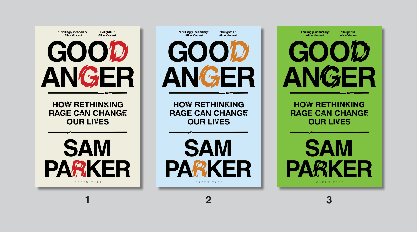
I originally envisioned something pastel, even beatific... perhaps the word ‘Anger’ set in rolling hills, entwined in flowers and basking in sunshine… Thankfully, one of the many humblings you receive in the course of writing your first book is that your idea is not the only one that counts, and rarely the best. There are editors and publishers and marketing teams with wiser heads all feeding in on the process.
We tried covers in greens and blues but, in my agent’s wise words, it created a dissonance that was unsatisfying. I also realised that, on a metaphorical level, it wasn’t particularly honest. I haven’t learned to love anger because it feels pleasant or joyful (it can, thanks to an amphetamine-like hormone called epinephrine, cause a temporary feeling of invincibility); it’s because the power it has to alert us to profound truths and spark us into action.
When a round of fluorescent covers with big, bold typeface came in, I initially balked. Too loud, too brash. Confident in a way I didn’t quite feel in the lonely trenches of edit five (or was it six?). We tried it paired back in neutral colours and got something that felt… fine. Safe. Reassuringly ‘smart non-fiction’. If I’d pushed for it, that would have been my cover. Cream with a little red snuck in. Respectable but forgettable. I could have stood by that cover and felt respectable but forgettable too.
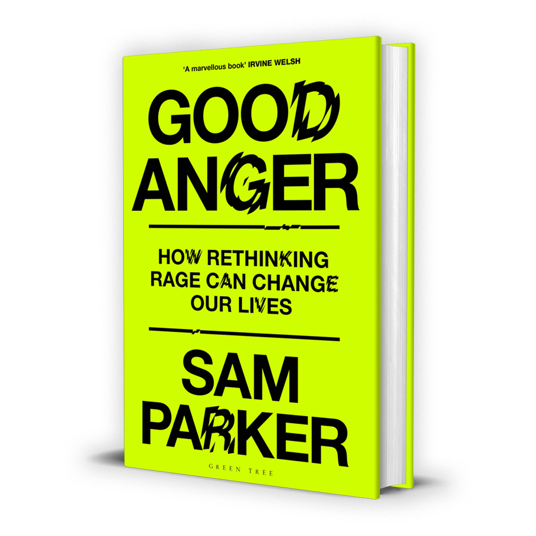
Then I thought: fuck it. I haven’t spent the better part of a decade deconstructing my relationship with anger – then three more researching and writing about it – just to go all aw-shucks at the end. The more I thought about it, the more fluorescent yellow captured what Good Anger is really about. Meeting the noisy energy of rage head on and transforming it into something electrifying and useful.
Anger, above all else, allows us to tap into our willingness to be disliked, and in my head that’s what this cover represents. It is, I think, both unmistakable and unapologetic. Plus someone (my agent again – thanks Imogen!) said it looked like a lo-fi rave poster or something by Jeremy Deller, which is more than good enough for me.
I hope you like it too.
Good Anger: how rethinking rage can changes our lives can be pre-ordered at Amazon or Waterstones.
great cover! I only really learned about the emotion of anger when I was about 50... Never allowing myself being angry because I'd never learned how to
great cover!